Aviva health insurance journey
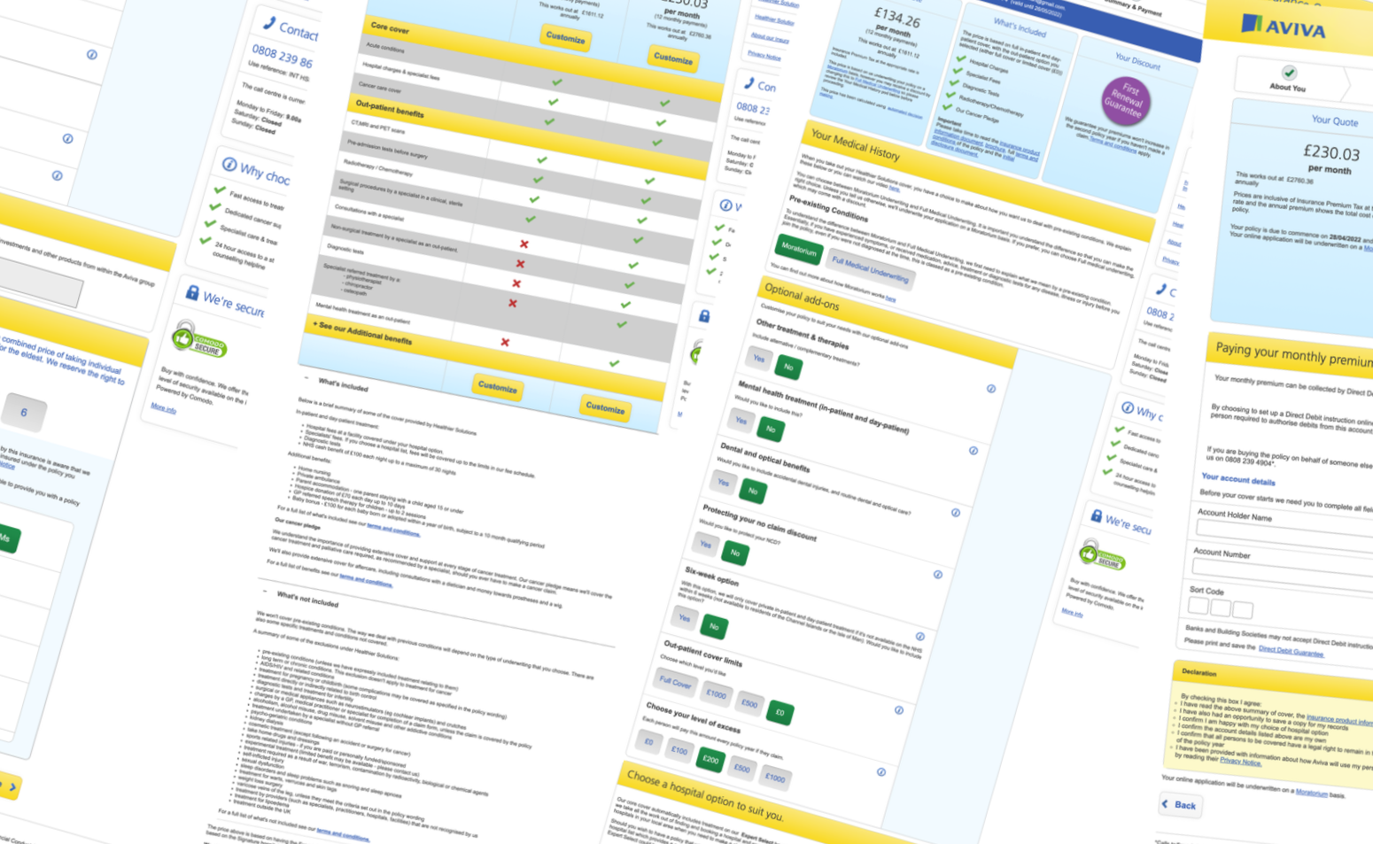
1990’S LENS FLARE DESIGNS
Problem
When I joined the health team, it felt like walking into a house where every room had been redecorated by a different person, at a different time, for a different reason. Nothing worked together.
Customers felt it too. They’d start a quote, hit confusing jargon, get lost in PDFs, then abandon the journey and phone Aviva-only to discover the adviser couldn’t see anything they had done. A quote that should’ve taken minutes turned into a restart. Conversion was stuck at 1.9%. Competitors were offering seamless, blended experiences. We weren’t. And yet the potential was huge.
I couldn't help but notice the Aviva masthead in the old Journey, it's rocking that classic 1990s Photoshop lens flare that we all once added to our designs :-)
Process
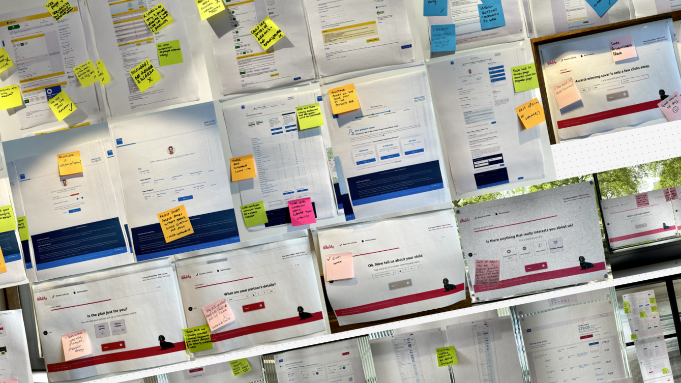
24 user interviews 50 session recordings- 8 competitors analysed
1
Research & discovery
Workshops & ideation
2
Cross-functional sessions - 150 ideas - 12 high impact concepts
6 test rounds - 48 participants - low to high fidelity iterations
3
Prototyping & testing
Extended Aviva’s design system with journey-specific components
4
Design system
WCAG 2.1 AA compliance - 47 improvements - screen reader tested
5
Accessibility audit